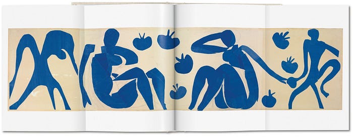
The Stretchy, Blocky People
I have noticed a trend in illustration which may be obvious to others more ingrained in the industry, but from an outsider’s perspective, seems quite odd, the result of which is my interest to understand this particular style of illustration I call, “The Stretchy People.”
Who are are the stretchy people? Or, rather, what is the stretchy people? Illustrated figures whose bodily characteristics are defined by elongated, angular limbs, thick bodies and small torsos or heads— in essence, a stretched-out, simplified depiction of the human figure.


If this type of illustration is a trend, how did it begin? Where did it stem from? There must have been some moment when all of the graphic illustrators around the globe decided this was a particular style to emulate going forward in the business, right?! No, that’s ridiculous thinking. Did this simplified style sprout from a specific school? Maybe it was when Matisse’s cut-outs became popular again?

Was there a Bauhaus for the exaggerated illustrated figure? Nay, no, la, niet, na, non … if anything, the school of the 21st century is the internet and shared spaces of collective collaboration or display (Behance, Dribbble, Instagram, etc.), and movements shift, grow depending on its impact. Like anything else which is designed for public consumption, its success and failure is dependent upon its relevance and impact — in this case, to sell or illustrate for business.
This movement, if one could call it that, is a success. The prevalence of long-limbed figures, or characters with exaggerated legs, arms, torsos, is something I cannot escape seeing everywhere. And maybe that’s because I am looking for them, but I cannot help but notice this trend and question its existence.
What is the appeal?
The figures are simple to comprehend quickly, their design is easy on the eyes and doesn’t make one think too long about the content. The illustrations are not abrasive, with just enough description of line, wrinkle, angle, perspective. The illustrations are also fun, and often times lite, which presents a goofy, approachable, unpretentious attitude towards whatever the advertiser is selling.

You see? I want to be living in this illustration. The colors are bright, the people look happy, and it is all very easily digestible.

The variations on the format is quick to see between different illustrators, but the overall impression is the same: stretchy, blocky limbs, exaggerated structure of human figure, simple shapes and bright, attractive colors.
I could go on finding more links between these illustrations and others, noting the similarities between this illustration and that graphic, but what’s the point? People are influenced by each other, and ideally, create work based on the excitement of seeing other people’s work. A breadth of inspiration has spread through the illustration market to produce these types of images.
Again, why is this style of illustration prevalent? Is it as popular as I am making it out to seem? Do these illustrations play to a certain market, specifically? Or can they be utilized across a wide spectrum of industries and uses? Perhaps the logistics of an ever-changing, rapid world necessitates illustrations made just as rapid, easy to consume, and non-threatening? Are there worse things in the world than a movement of illustrations which simplify the human figure to a series of blocky, exaggerated, stretchy shapes? Obviously, yes.
How will this style change, and will it continue to include the kinds of diversity in style and perspective that exists in this diverse world? Because, while this style is considerably popular, I find it disheartening that it is exactly that, a certain style, rather than an expression. This style produces a certain feel and aesthetic, relevancy among the current trends of the day, and implicates a certain mood which the stretchy people represent. Looseness, fun, liteness, love?

Trends and fads come and go … I wonder where this one will evolve into next?
